Dead Clicks: When Less Makes More
Introduction

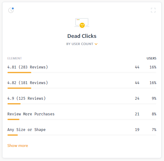
The high rate of dead clicks on the bar indicated that users were consistently misinterpreting the graphic as an interactive selector. This behavior was confirmed by watching session replays and soliciting feedback. User feedback indicated that some users thought the feature was broken, while others became frustrated by the inability to select a firmness. Both scenarios were causing site abandonment and loss of orders. We tested the following changes to try and make it more obvious that the firmness bar was not an interactive element:
- changing the firmness bar from being assembled with HTML to a single image
- replacing the firmness bar with only text
- adjusting the styling of the firmness bar so it looked less button-like
None of these approaches worked, so we changed tactics to try and leverage the click activity instead. We iterated on a series of tests that added an accordion dropdown that provided direction on how to place a custom order. This second set of experiments were not successful either.
Testing
Hypothesis
Comprehension: From behavioral analysis with FullStory and learnings from previous experiments, we observed that the firmness bar is a high dead-click target. Repeated attempts to leverage or curb this behavior have so far been unsuccessful.
Response: We want to remove the firmness bar from category and product pages on all breakpoints for all users.
Outcome: Removing a point of distraction/frustration should improve focus on primary CTA points for targeted pages.
Test Execution
Tech Stack
- Behavioral Analysis Tool: FullStory
- Split Testing Tool: Convert Experiences
- Data Analysis Tool: Google Analytics
Planned Estimates
- Run Duration: 35 days
- Sample Size: 28,000 unique visitors
- Minimum Conversions: 200 orders
- MDE: 15%
- Confidence Threshold: 95%
Executed Thresholds
- Run Duration: 35 days
- Sample Size: 29,727 unique visitors
- Minimum Conversions
- Show Bar: 208 orders
- Remove Bar: 238 orders
- Improvement: 16.00%
- Confidence: 94.48%
All executed parameters met their planned estimates within an acceptable threshold.
Analysis
Goal Graphs
Summary
On average, about 8% of users were dead clicking on the firmness bar. Removing it (obviously) eliminates those dead clicks entirely. This behavior change was verified through sampling session replays for users placed in both variations. Users that did not see the firmness bar tended to have greater session time and lower abandonment rates, as well as being more likely to purchase within their initial session.
Removing the firmness bar caused a relative 16% improvement in overall order conversion; an absolute lift of +0.22% from 1.39% to 1.61% (+0.02% over the ±0.2 confidence interval with 94.48% confidence). This translates to just under an additional order per day overall (+0.94), or about +$300 per day based on current AOV.
The site is built with templated components, so removing the firmness bar is fairly low effort. Removal can be completed and deployed within an hour or two. Implementing the successful result will cover the expense of testing and site development within a week. The change will have a long-term positive return because it affects a core display element of the site, something that was a permanent feature shown to all users across multiple page types.
Conclusion
Dead clicks cause user frustration, leading to increased site abandonment. In order to understand the reason behind a dead click, you need to look at element importance and user context. Element importance is the visual priority level of the dead clicked element. Was it a dead click on the site background? That was probably an accidental click and not all that important. Dead click on the text in a paragraph? Maybe there’s something interesting in the text that the user was hoping to explore further. Use a session replay tool to help determine user context; see what the user was doing before they triggered the dead click.
List of Revisions
- September 3, 2020: Added publish and revision dates after headline. Added tech stack list to Test Execution section.
- September 5, 2020: Added screenshot of FullStory dead clicks UI panel to Introduction section.


